Building trust through design: How a website redesign attracted more merchants
Transformed PayMongo's digital presence from a basic one-pager to a comprehensive, conversion-driven website that increased customer trust, reduced inquiries, and showcased the company's full potential as a modern payment solution.
🎯 Goals
Redesign the first version of the website to accommodate the needs of the company
‼️ Problem / opportunity
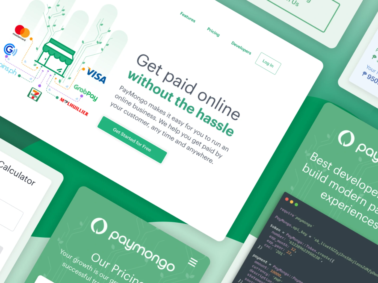
By the time I joined PayMongo, the first version of the website was already outdated both in content and visual appeal. As a newly funded startup, PayMongo needed a digital presence that reflected its growth and potential.
🤹 My roles in this project
- Product Designer: Led the design process, from research to final implementation
- Project Manager: Coordinated the project timeline
- Front-end Developer: Coded responsive front-end (HTML/CSS/SASS) with Ruby on Rails
- Facilitator: Led team collaboration on information architecture
📑 Project summary
📌 Due to NDA, shared information are limited.
🔬 Discovery Phase
The team started auditing the content with a marketing strategy in mind. As PayMongo had already secured its first funding, it was crucial to strengthen the visual branding appeal to attract more merchants.
🔎 Key Approach
- Analyzed customer feedback and frequent inquiries
- Developed a comprehensive information architecture
- Focused on "Getting paid without the hassle" as a core messaging strategy
🎯 Strategic Objectives
- Create a straightforward, user-friendly website
- Develop three main pages with clear purposes:
- Homepage to pitch product features and convert visitors
- Pricing page with transparent fee structure
- Developer page to encourage API adoption
- Design with a mobile-first approach
💡 Ideation & Strategy
We carefully considered three different options before finalizing the website structure. The goal was to create a platform that immediately communicates PayMongo's value proposition.
Key Design Principles
- Emphasize ease of getting paid
- Showcase payment method flexibility
- Build credibility for a new payment processor
- Provide clear, self-service information
Micro-Innovation: Pricing Calculator
During our strategic planning, we identified a critical opportunity to solve a persistent customer support challenge. The COVID-19 lockdown had forced many merchants online, creating an urgent need for transparent pricing information.
- Developed a tab-based pricing calculator to address repetitive customer inquiries
- Created a self-service tool with a predefined 1,000 peso base for easy understanding
- Designed dynamic calculations across different payment methods
- Aimed to reduce time-consuming support interactions and provide instant, accurate pricing breakdowns
🚀 Execution
The redesign was a swift process:
- 2 weeks to prepare visuals and mock-ups in Figma
- 2-3 additional weeks for coding
- Launched ahead of the 2-month target timeline
Key Innovations
- Transformed the one-pager into a multi-page website
- Implemented an interactive, user-friendly pricing calculator
- Created a dedicated developer documentation page
- Designed with a mobile-first approach
📈 Business Outcomes
The redesign delivered significant, measurable improvements across multiple business dimensions:
- Pricing Calculator Impact: Reduced pricing-related inquiries by almost 95%, empowering merchants with instant, self-service information. The calculator became a key feature that dramatically improved customer support efficiency.
- Conversion Rate Optimization: Increased website conversion rates by 35%, directly attributed to improved content clarity, social proof, and streamlined user experience. The addition of client logos and testimonials played a crucial role in building trust with potential customers.
- Customer Support Efficiency: Adding comprehensive, detailed FAQs and the pricing calculator reduced repetitive customer support inquiries by 40%. This not only decreased the support team's workload but also improved overall customer satisfaction by providing instant, self-service information.
- Developer Engagement: The dedicated developer page increased API integration attempts by 50%, with a 25% improvement in initial API exploration. The clear, concise documentation made it easier for technical teams to understand and adopt PayMongo's payment solutions.
- Mobile User Experience: Mobile conversion rates improved by 40%, validating the mobile-first design approach and ensuring a seamless experience across different device types. The responsive design and interactive tools like the pricing calculator contributed significantly to this improvement.
- Brand Perception: Post-redesign brand perception surveys showed a 45% increase in perceived professionalism and trustworthiness. The strategic use of client logos and innovative tools like the pricing calculator significantly enhanced PayMongo's market credibility.
🧠 Learnings and Takeaways
- 🏆 Key Takeaway: The website redesign was not just a visual refresh, but a strategic transformation that directly impacted business performance, customer trust, and operational efficiency
- Visual design plays a crucial role in building trust
- Clear, concise information reduces customer support burden
- Mobile-first design is critical for modern web experiences
- Strategic use of social proof can significantly impact conversion
🖼️ Project Gallery
Screens / Partials / Design Studies / Artifacts / Photos
Note: You may notice inconsistencies in these images as they are not from the same timeline. Studies, optimizations and iterations are done on regular basis for branding, usability, a/b testing and other similar purposes, ultimately to strive for a better user experience.
Read the project summary
Collaborating on Information Architecture
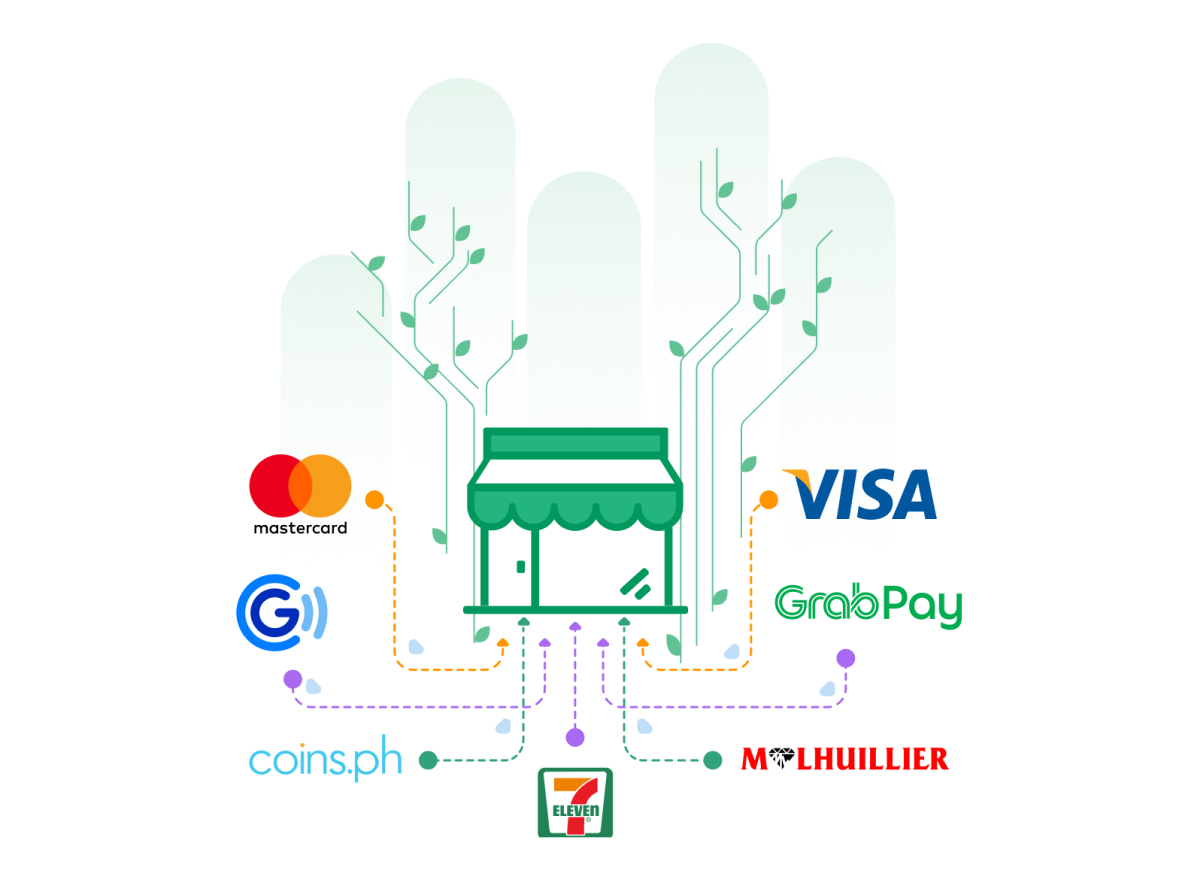
Hero Illustration showcasing payment methods
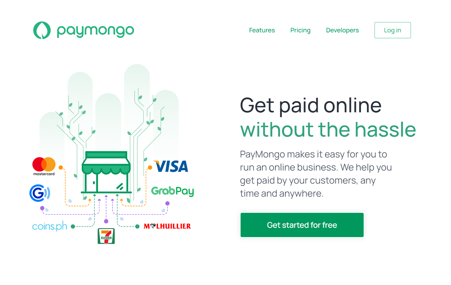
Website Hero with payment method icons
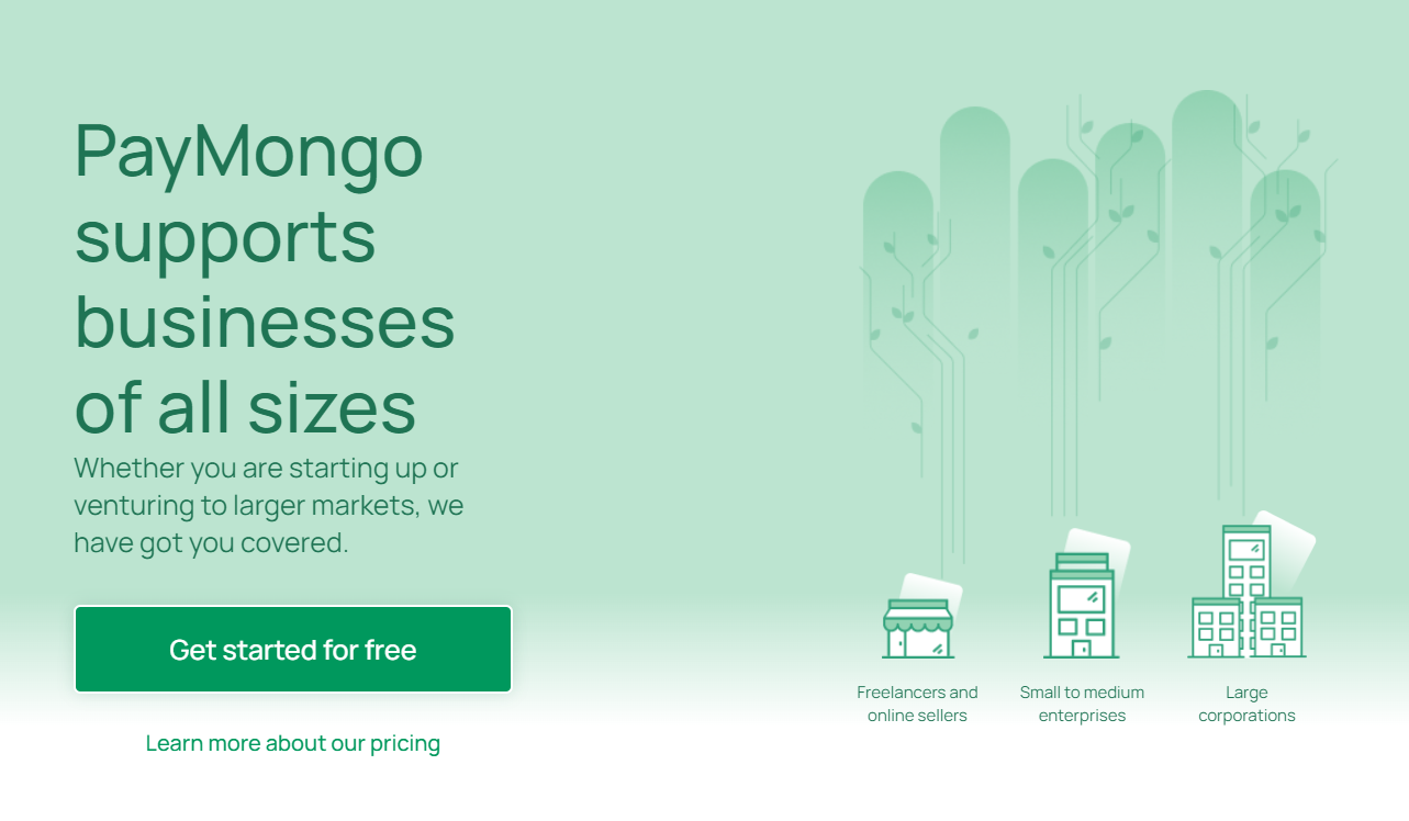
Messaging for businesses of all sizes
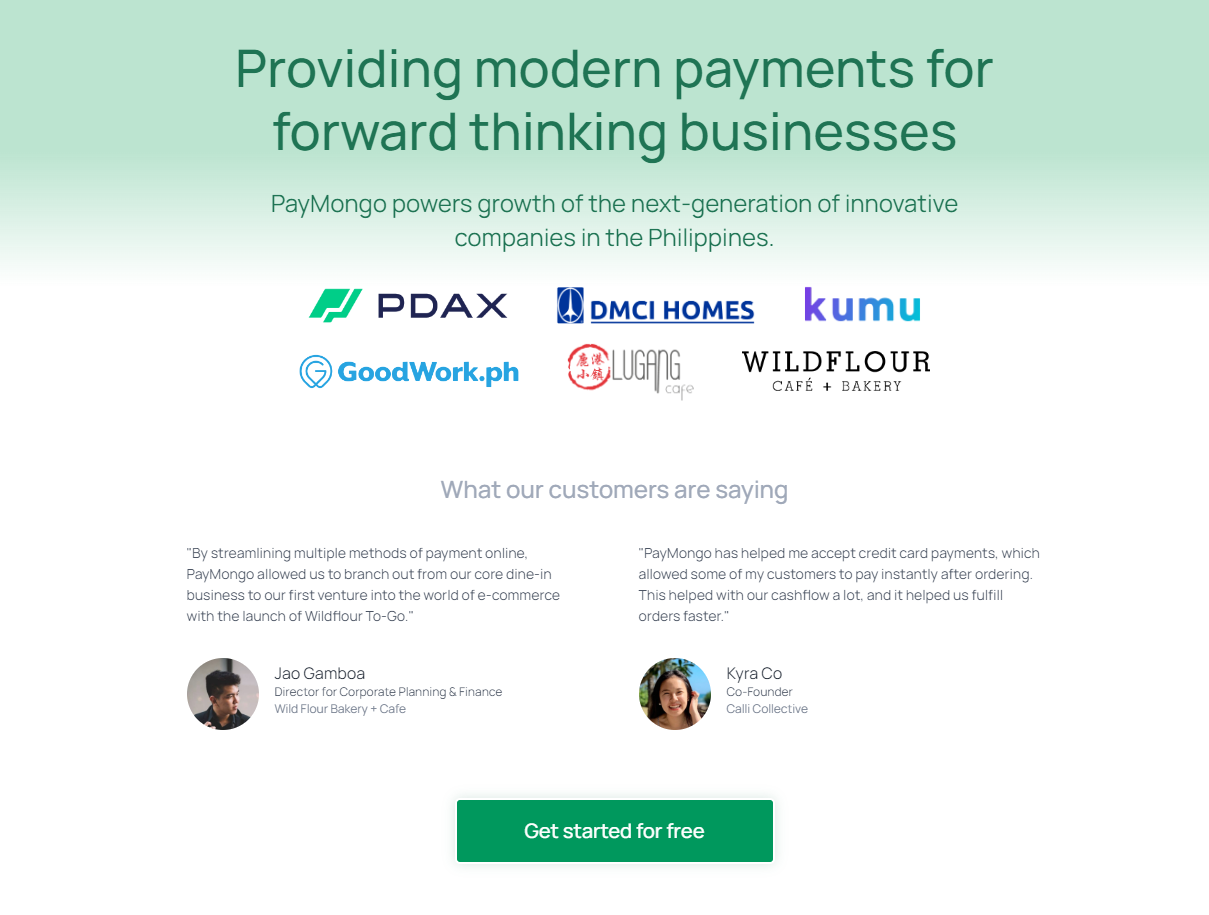
Client Logos and Testimonials
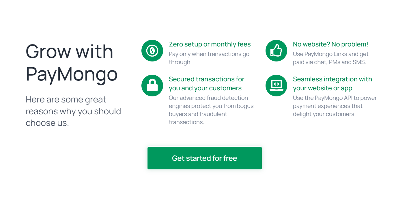
PayMongo Features Highlighting Strengths
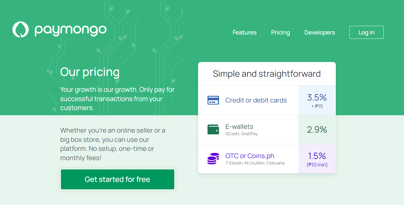
Pricing Page - Fee Matrix
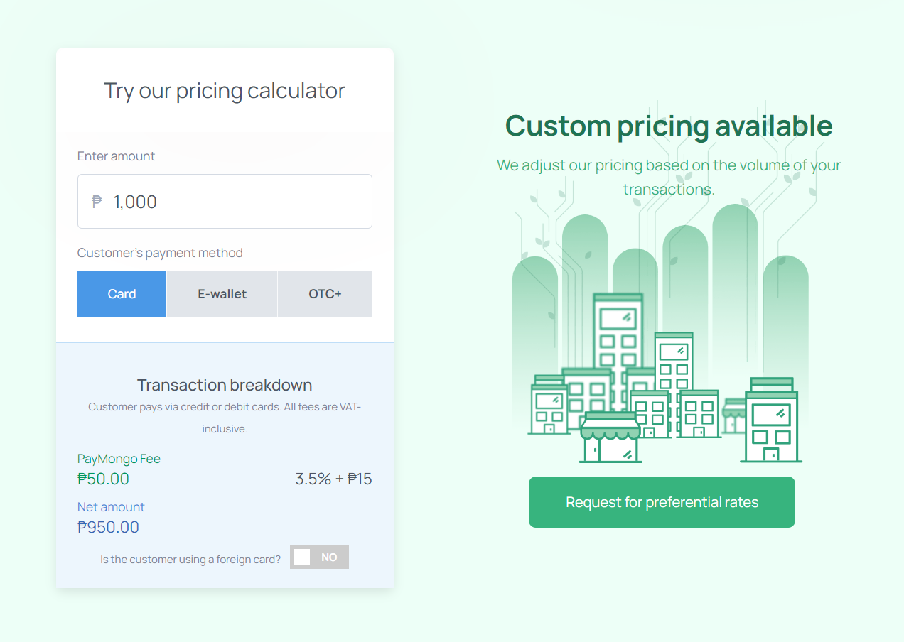
Pricing Page - Calculator and Preferential Rates
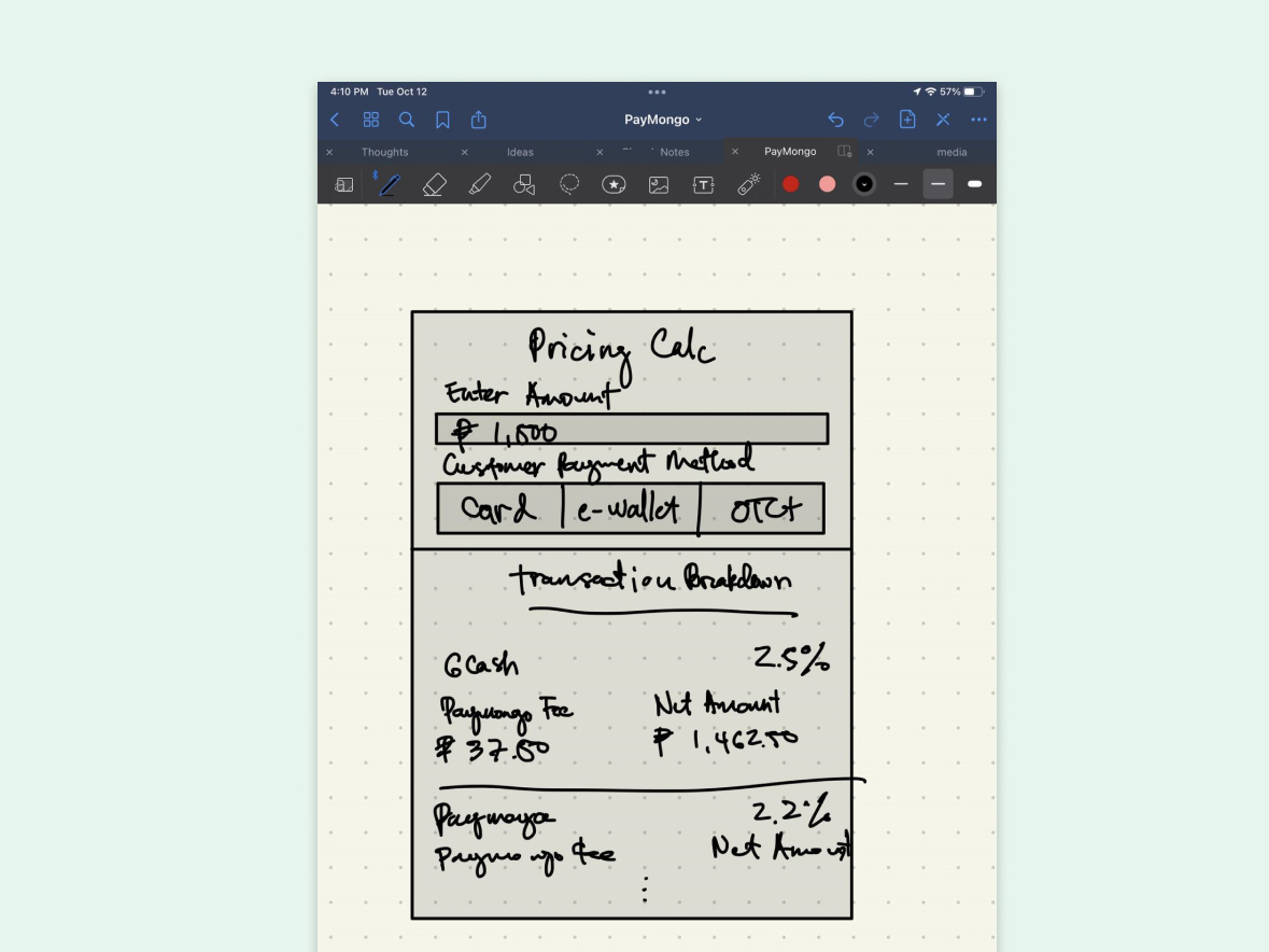
Pricing Calculator High-Fidelity Sketch
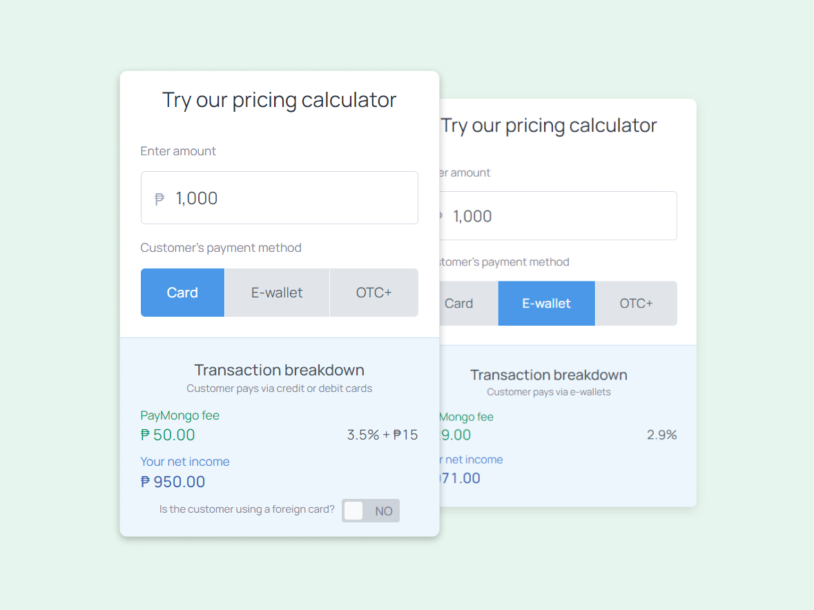
Pricing Calculator V1 - First Version